Reel Good Fish
A fresh fish and seafood shop at Stoneridge on Lunn in Mount Wellington, Auckland, selling restaurant-quality fish straight off small local boats. We created the brand guide and logo suite, then carried the brand through business cards, shopfront and window signage, uniforms and a website.
Brand guidelines
The bible for the brand.
A brand guide is the foundation of everything, and it stays a living document that changes as the business grows. PRD specialise in detailed guides that work as the bible for a brand, often with a full set of logos for every application.
The Reel Good Fish guide covers the colour palette with print references, the Alga and Heimat type system, logo clear space and minimum sizes, correct and incorrect use, and how the brand looks on cards, uniforms and the shopfront. The client hands it to any supplier ordering signage, print, stationery, a website or merchandise, so the brand stays consistent.
Cover. The engraved snapper on Primary Aqua.
Colours. Five core colours with screen, print and Pantone references.
Logo and fonts. The logo on every brand background, plus the type families.
Type. What each font is for, with examples and setting rules.
Tagline. How to write it, set it and use the fish on its own.
Brand in use. The shopfront, with a dimensioned plan and signage rules.
A handful of pages from the guide, chosen to show its range. This is not the full brand guidelines.
Brand guides
Ask me about creating your brand guides.
Every new brand needs one, and plenty of established brands never got one. See Brand Rescue to find out how I can build yours, from colour and type to logo files your suppliers can actually use.
Logos
One snapper, every application.
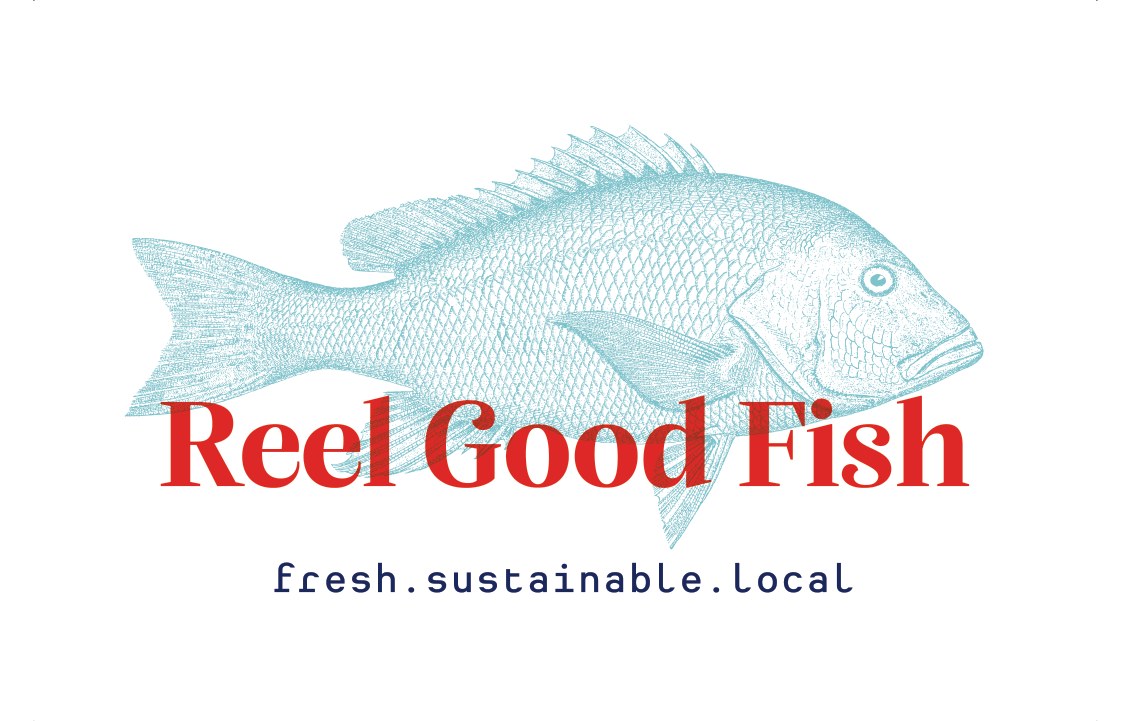
The brand is built on an engraved snapper, a red Alga wordmark and a plain monospace tagline: fresh.sustainable.local. The tagline is three promises a customer can check at the counter.
The guide comes with a complete logo suite so every supplier has the right file: the primary logo, a version without the tagline, a stacked logo for tall spaces, name and tagline, name only, and favicon and social icons. Each one is supplied for light, aqua and dark backgrounds.
 Primary, on aqua
 Primary, on light aqua
 Primary, on white
 Stacked, navy tagline
 Stacked, white tagline
 Social icon
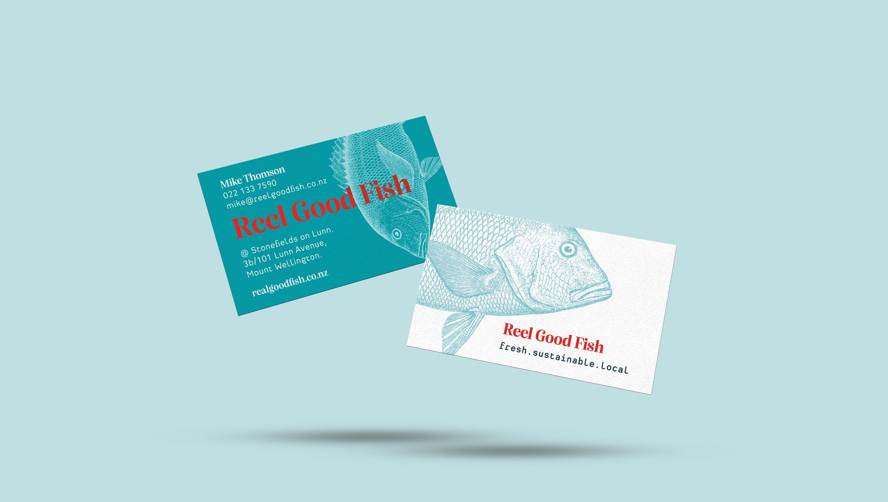
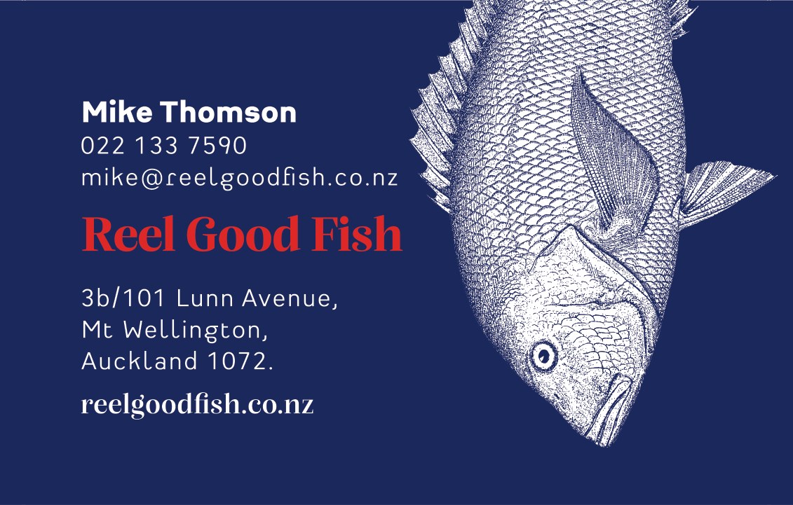
A white front, a navy back.
The engraved snapper does the talking. On the white front it sits behind the full colour logo, and on the navy back it swims off the edge beside the contact details.
Signage
One frontage, two shops.
Early on, Reel Good Fish and Mapari Meats decided to knock a wall down and share the space. With Reel Good Fish getting a fresh look, Mapari came on board so the whole frontage matches. It completes a land to sea story: premium award winning meat and fish under one roof.
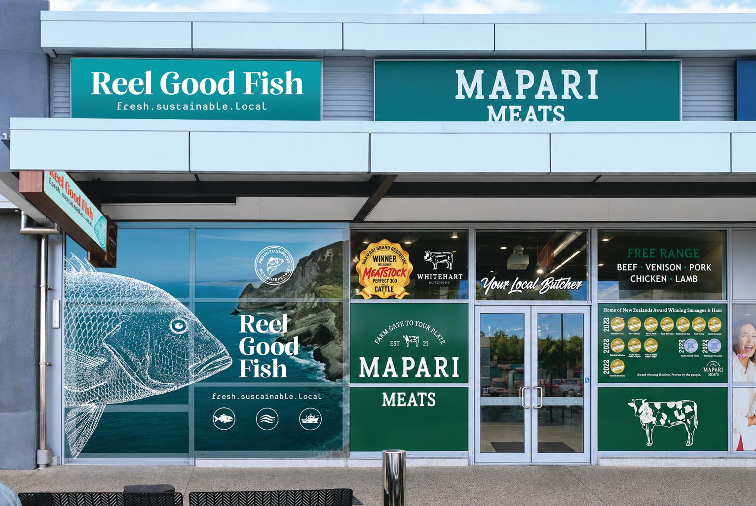
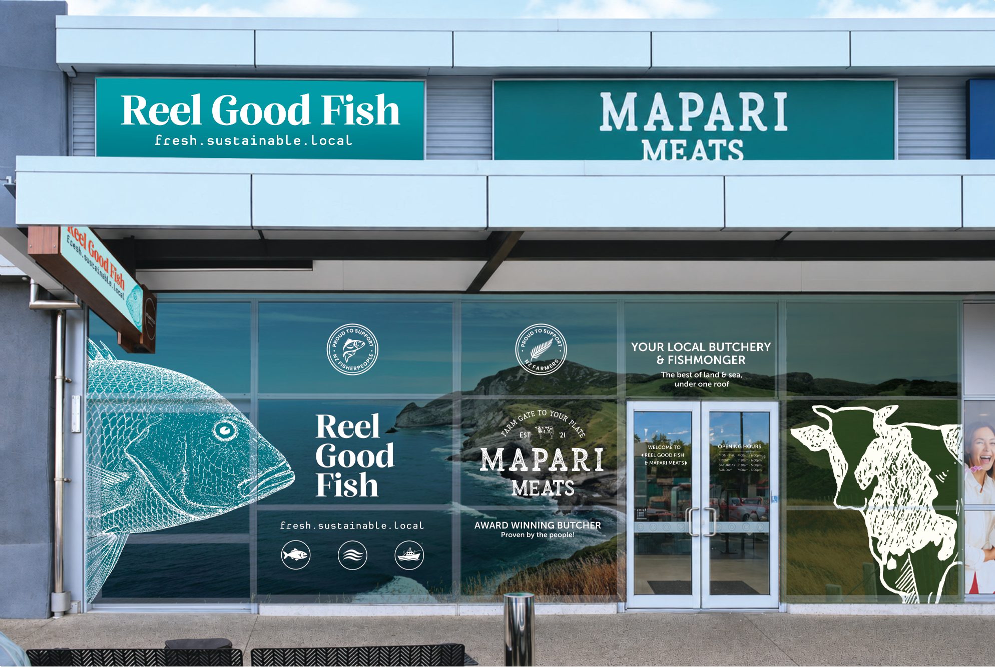
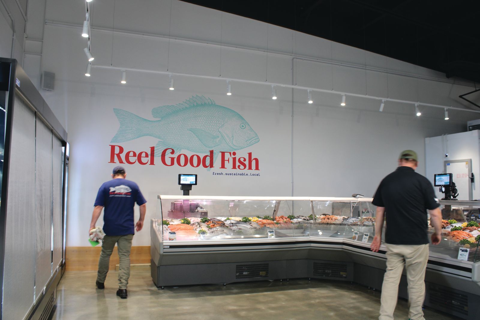
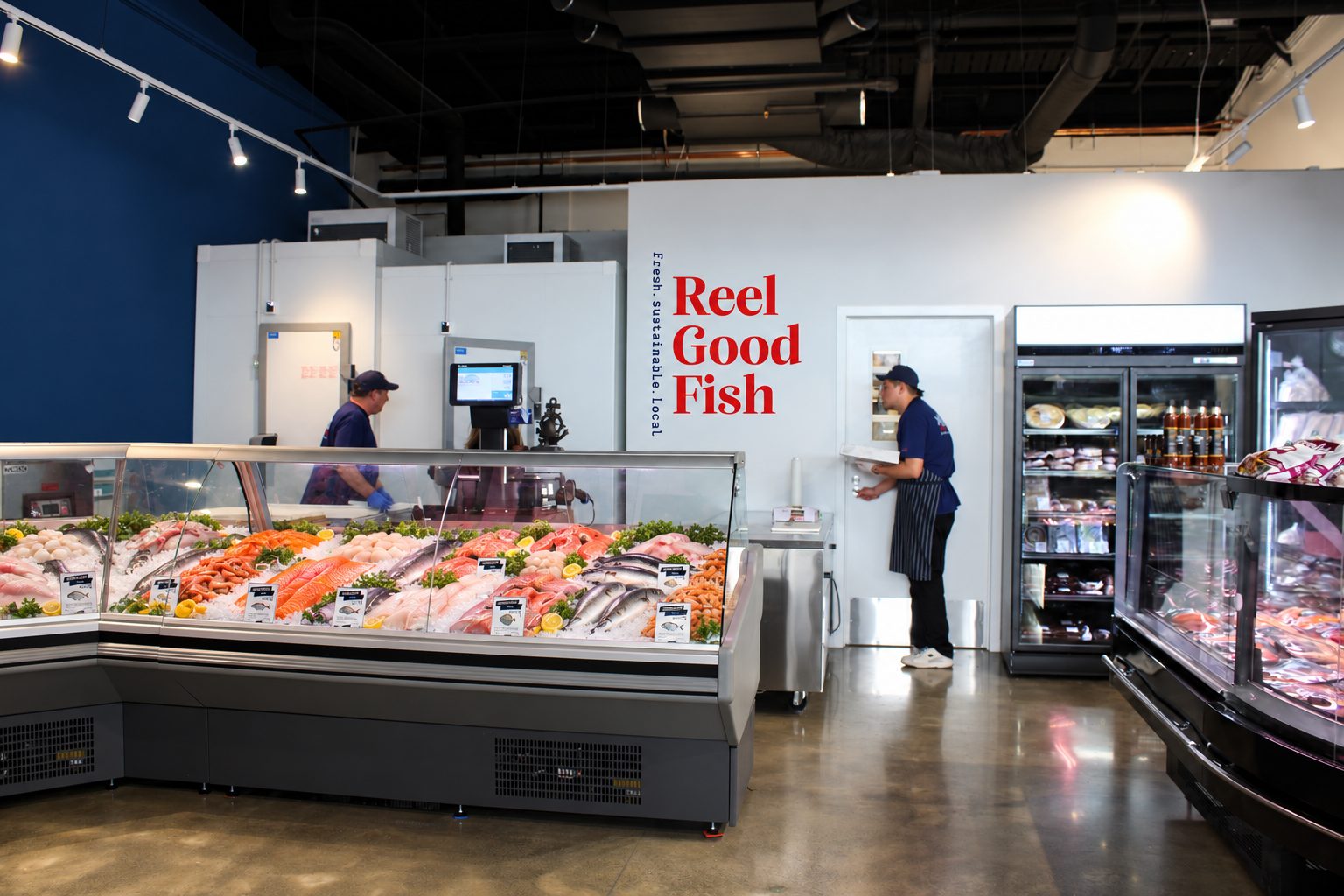
Reel Good Fish also has lightbox veranda signage and top signage, made to the Stoneridge on Lunn specifications. Signage images are design visuals.
The website
From a one page opener to a fun, living site.
The website began as a one pager to support the opening of the shop. Then we got a bit carried away, because Reel Good Fish is such a fun brand to build for.
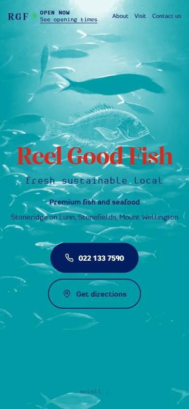
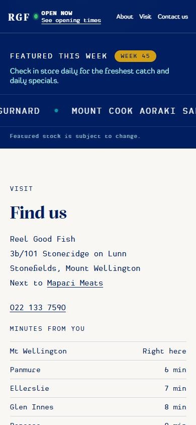
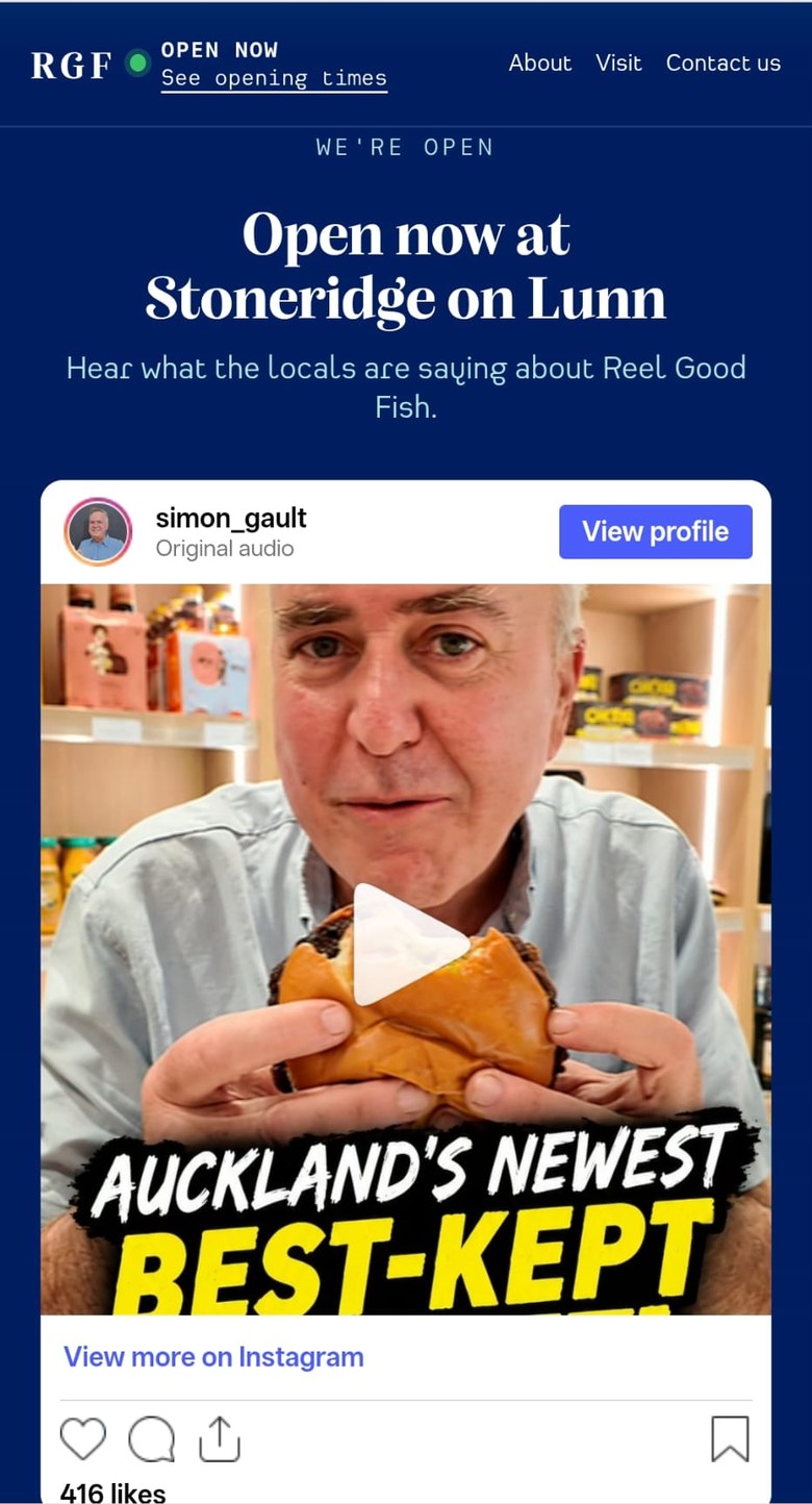
The client wanted an eye-catching first screen with movement, so a shoal of fish drifts behind the engraved snapper and the logo. Catches change through the week, and so must the offering, so a featured this week species list scrolls across the page. Local endorsements, including a video from Simon Gault, come through from Instagram. Next up are recipe ideas and take-home meals prepared on site by a qualified chef.


On mobile
Built for a quick look on the go.
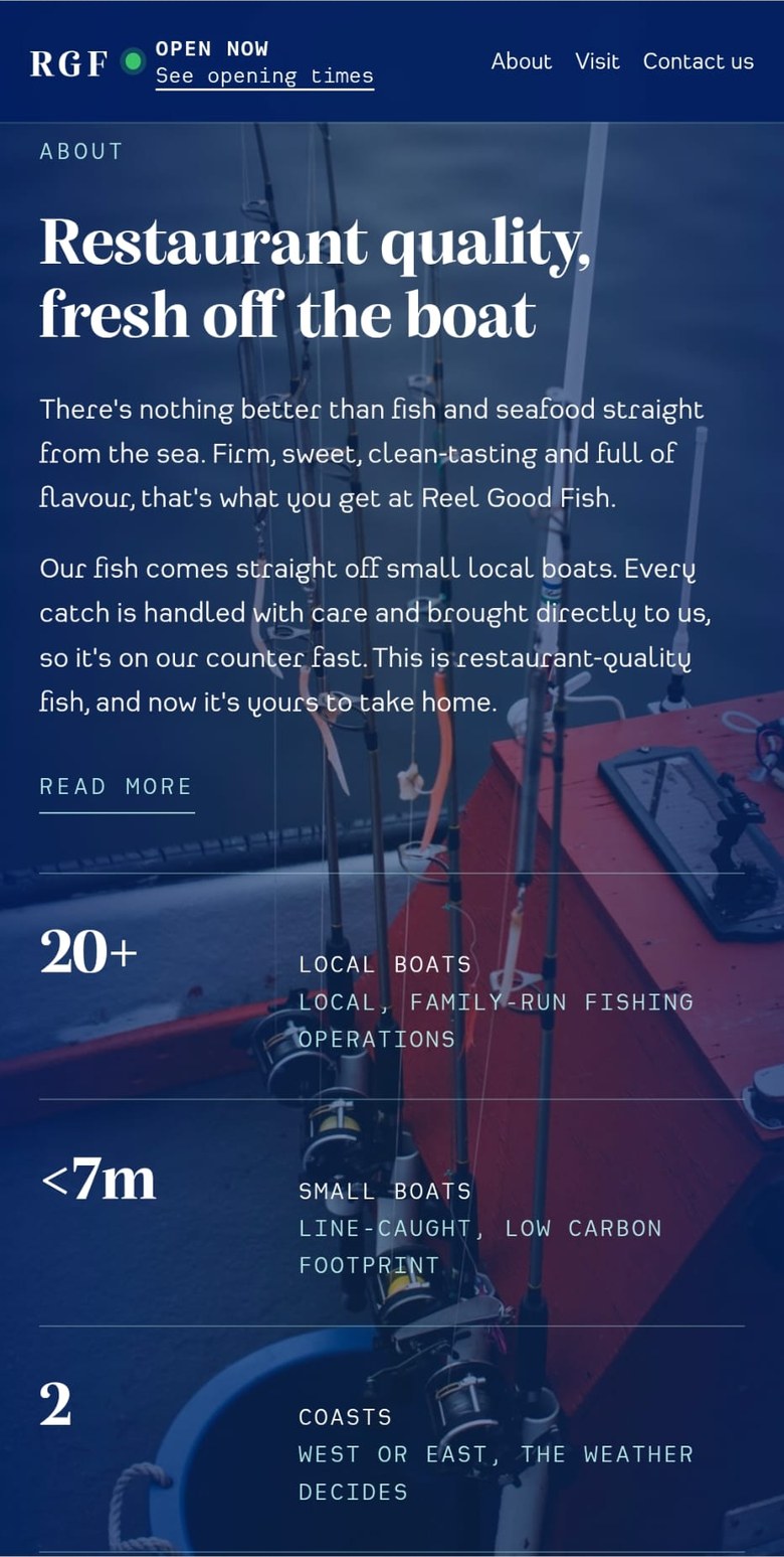
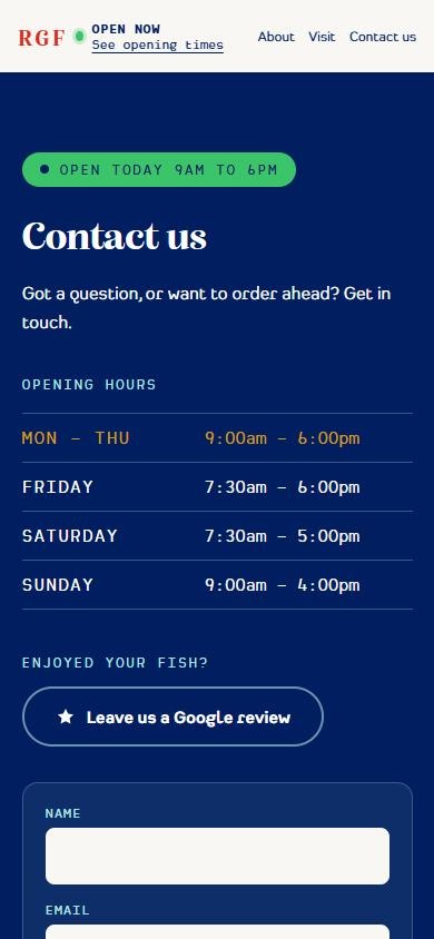
Most people check the hours or call from their phone, so the phone number and directions sit on the first screen and the open now status follows you down the page.
Uniforms
Dressed in the brand.
Unisex uniforms with a matching cap, in the brand colours: tees, polos, an apron and a cap. The stacked logo sits on the left chest, the fish and wordmark go across the back, and a summer breathable version is planned.
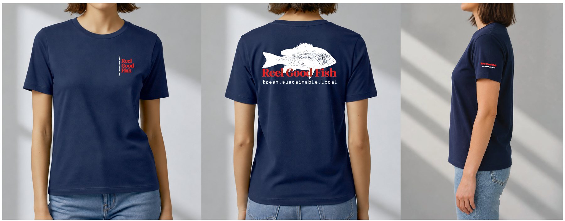
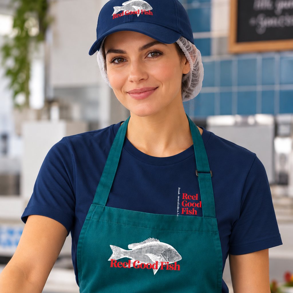
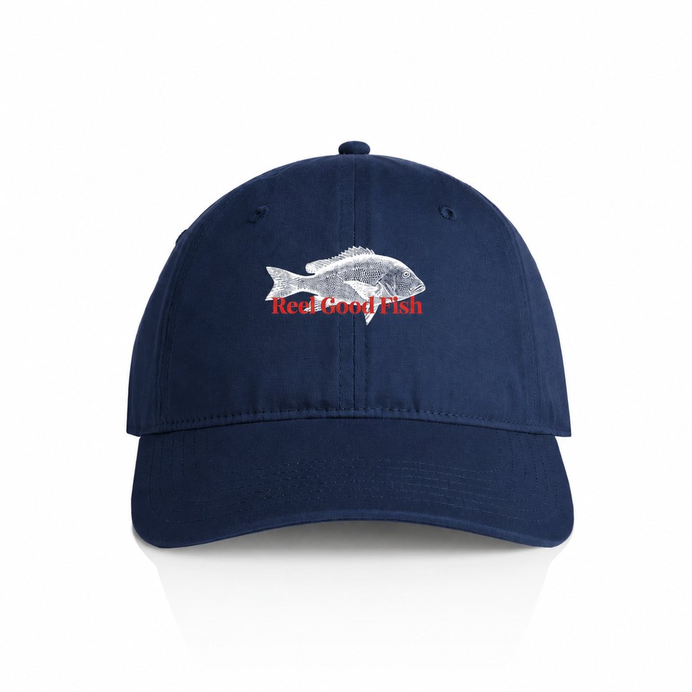
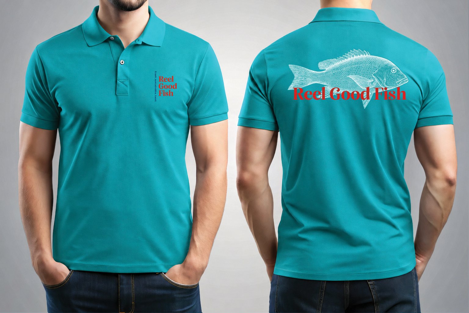
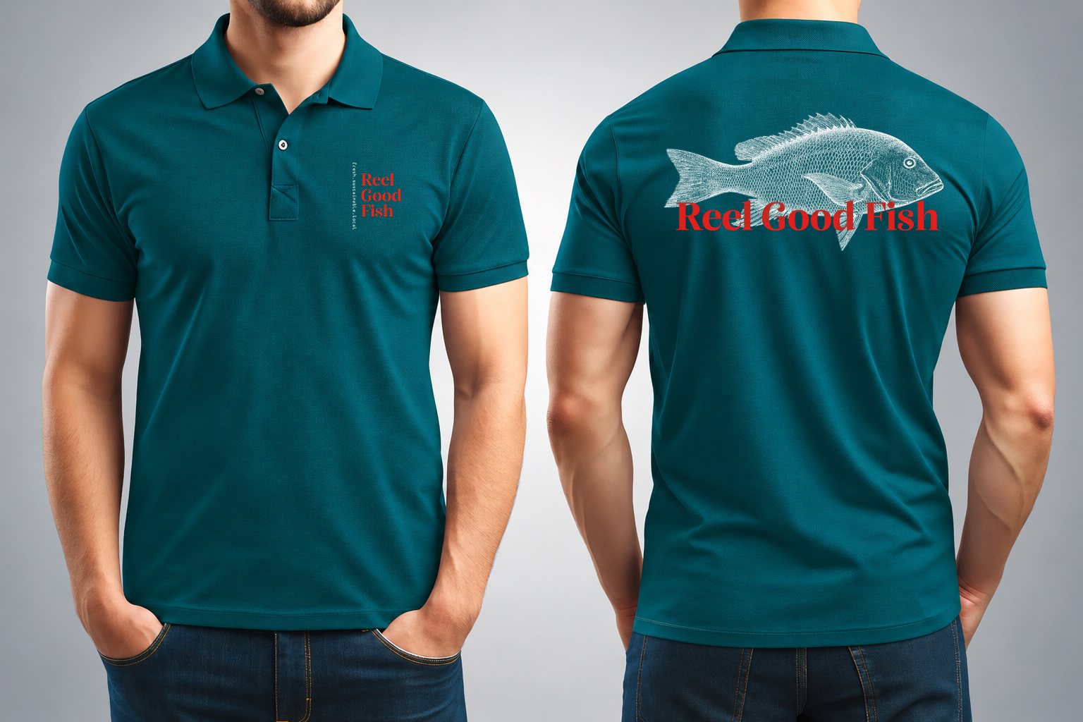
Made by Threadworks, a family business with great service, deep knowledge and a quick turnaround. Uniform images are design visuals.
More projects